Background:
I was thrilled to be approached by the manager of Mandrare River Camp, nestled in the heart of Madagascar, to undertake the redesign of their logo. The manager expressed a desire for a logo that embodies simplicity yet captures the essence of the camp's location and significance to the local community. Having had the privilege to visit the camp last year, the project holds personal significance, resonating with my passion for culture, travel, and the diverse wonders of our world.
Process:
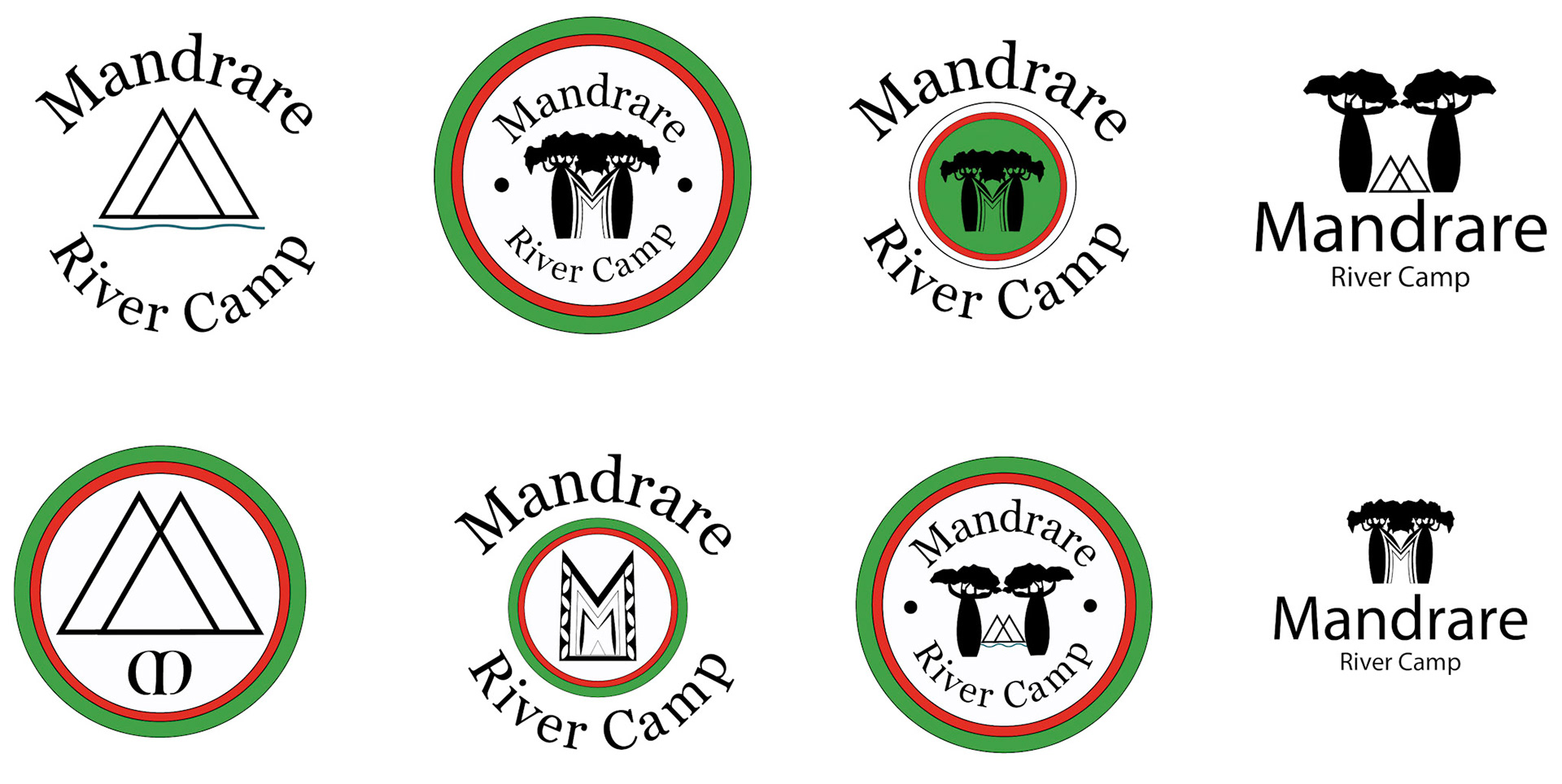
With the iconic baobab tree, symbolizing strength and resilience, being the national tree of Madagascar and prevalent in the camp's surroundings, it serves as the focal point of inspiration. Additionally, incorporating the national colors of red, green, and white, which hold deep cultural significance, further reinforces the connection to the local heritage. Situated along a vital river, the logo will also pay homage to this integral feature of the camp's environment. I was excited to craft multiple design options that encapsulate the spirit and identity of Mandrare River Camp, celebrating its unique position in Madagascar's rich tapestry of natural beauty and cultural heritage.
Final Series Presented:

Final Logo: